April 30, 2010

Kitchen accessories by IKEA

I like this kitchen island by Ikea (a big "accessory")

There is this wooden board to swing open and have breakfast.

The island consists of DACKE table (above) ...

... and DACKE trolley

 I want one or two of these metal shelves (but the fixing is not that pretty).

after dish washing a "drying shelf" - very Italian

another "work space saving storage shelf"

Below samples about how the metallic shelves (all GRUNDTAL) could be combined and how they would look like:


Here, I also like this UTBY shelf under the workspace

Not an accessory:
a simple minimalistic kitchen with cooker and sink. Ideal for a small budget and small space (just a fridge to add):

Unfortunately, there is no IKEA in Calabria (and I am not getting paid for this"ad").


One more accessory (not by IKEA):

A wooden board covers the stove when not needed and provides additional working space for a small kitchen. Simply move it to the side when cooking.

April 28, 2010

Small kitchens

As I am looking at small kitchens - kitchens that are like pantries, linear kitchenettes, minimalistic kitchens in living areas - all over the internet, I have found some pretty inspirations. Those pics I am filing and sharing here:

When you want to hide this kitchen, just unfold the large folding doors.
However this kitchen does not need to hide with its beautiful mosaic walls.

Camouflage: the kitchen melts togehter with the living area by using the same colour scheme. Having enough space on the buttom allows not using overhead storage and a more elegant look.

 
Using bold colours on the wall behind the kitchen brings the focus back to the kitchen. However, the long red shelf instead of overhead storage cupboards let the kitchen not appear like an ordinary kitchen. The kitchen's furniture is part of the living area.

This bold red shelf has a second function: it is the fume hood. Cool !

An vintage orange kitchen with inox fume hood and shelf for drying plates. 
(I am attracted by all kind of inox kitchen accessories!)

A flickr find: orange smeg in small kitchen

traditional metal kitchen in modern ambiente

 
One piece: sink, working and cooking

a walled kitchen (from a tile catalogue)

a 'living in" kitchen

During my research (for our own project) I liked more and more that cooking and living are melting together. Especially in small spaces it helps to have no harsh separation between cooking and living. I like when these two areas blends into each other.

There is only one rub:
to get this trendy look it is better not to hang overhead cupboards. But in small spaces this is a waste of storage space - unless you do not use your kitchen for cooking that often ...

April 26, 2010

online renovation

When I did not post often in the last two weeks, then it is because I am busy doing online renovation and interior drawings.

Amazing what the internet makes possible.

Not only communication via email and skype makes a renovation across countries easier. Very essential, you can find all manufacturers online and download their catalogues to choose material and products and check right away technical data. Of course you need to have someone on site who understands what you want. In my case it is CC, my husband.

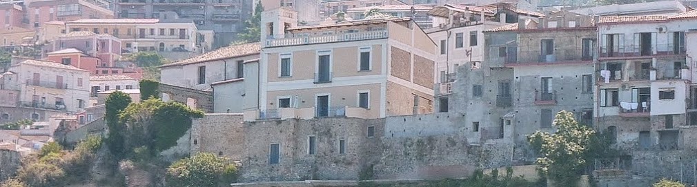
I left Pizzo about two weeks ago to come back to Germany where our son goes to school.
CC, however, kept staying in Pizzo along with his parents to push forward our project.

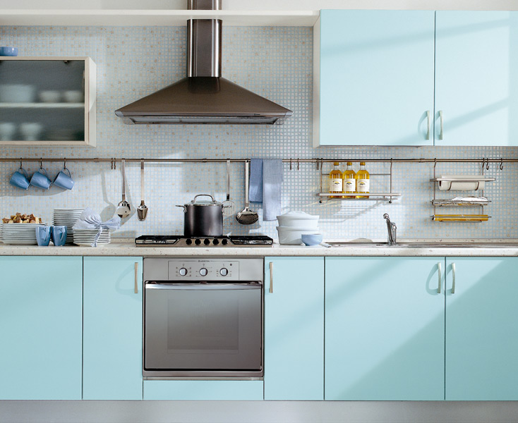
He goes every morning with Angelo to the house and meet workers and crafters. Angelo and CC themselves even lay hands on. And they would drive throughout the region to find the right kitchen, to get sample marble stones, to check out tiles and mosaics, to buy paint and other construcion material.

During lunch break CC would send me photos of the progress, photos of tiles he has seen and links to catalogues that I would have to browse online. In the evening we would skype. And late at night I would send my replies that CC would consider in the morning. We have sometimes up to ten mails going back and forward on different issues: bathroom sanitary installations, flooring, door types etc.

CC is the analytic manager who likes fast decisions. And I am the chaotic creative who wants to check out all options to make sure we do it really right. I am driving him crazy by sending him more and more options. And he keeps me up until long after midnight to answer all his requests.

But more and more decisions are made, and they come faster.
One thing helps: that we agree on each other taste and ideas quite often.

To get you into the picture - here are some of the files I have mailed him last night:

I am proud to have found these tiles. Actually there was only one in the picture and I made the "carpet" of tiles with my photo editor. This was probably the only time, when I was sure from the beginning: this is our tile for the master bathroom floor. (Greca by de Maio)

And that evening I was not chaotic at all, just straigth creative. I have added another tile that we will use for some wall areas in the bathroom. (Vecchia Napoli and Graca by de Maio)
And CC liked it right away!

here is some drawing on mm-paper

we will add a installation wall for the sinks (here second type of Vietri tiles) and my calculation for the volume we will have to order.

to make it easier for CC, I also captured the technical data from the Duravit catalogue. The 585 hight is necessary to know when building the installation wall.

I am having fun. But it is also exhausting to work that late at night for me. And I am online all these hours and have no time to post... this is must stop. I will have to catch up and update this blog.

April 24, 2010

Great white kitchen by Paola Navone


An all white kitchen including white walls does not have to look boring !
This is the kitchen of Italian architect and designer Paola Navone in her house in Greece.

I am impressed by this simple, yet functional and beautiful kitchen. The first thing I recognised is the precise measure work they must have done with the window and the below water tap. I am wondering how they can open and close the window. We have about the same window situation and needed to place the sink into the corner. 

It would be our layout situation - if it would be that way with a sloping roof :


But we have changed our plans to a single line kitchenette.
So far it is all white - the colour of the fridge is not decided yet.

I found this kitchen via the Italian blog design & more. If you want to see more pictures of Paola Navone's retreat in Greece go to the style-files.

April 13, 2010

Sicilian traditional tiles as main design theme for new contemporary resort: Verdura Golf & Spa Resort

Southern Italy, especially Capri and Sicily, is famous for its beautiful ornamented tiles with bright mediterranean colours. Handpainted maioliche have their origin in Mallorca (Spain) and have inspired Italian crafters from Vietri near Naples to Caltagirone in Sicily.


It is kind of obvious to use mediterranean tiles (piastrelle) when renovating or remodelling a house in the South of Italy. Even when building a contemporary house or hotel, one should consider to catch the atmosphere of the location by using local traditional material and patterns in some way.

In a rough Southeastern Sicilian landscape the new Verdura Golf & Spa resort combines contemporary architecture and design with local Sicilian culture and tradition. Interior designer Olga Polizzi found a simple way to retain old customs by interpretating patterns of Sicilian maioliche (tiles) in a modern way throughout the resort :

patterns of piastrelle are remixed in the casual dining area (above and below):


The giant tiles are handmade by a workshop in Caltagirone.
They pick up a local motif of the 18th century that became the decorative theme of the entire resort.

In the lobby, cushion covers and lamp shades pick up parts of the tile's pattern.
Even the webside of the resort is using the theme on its pictures (see above pic left side) like a watermarking.

In the rooms the theme is on bed covers, cushions and lampshades.

On some walls the design of the tiles is stenciled. However, with very restraint colours, like a watermark, to not be too much for the visitors eyes.

I think it is a very clever idea. I might 'copy' this method for some wall decoration in our house. I could re-use some pattern of the few old tiles we inherited with the house. Although they have more a Greek influenced geometrical design than a floral elaboration. Or I am just painting the above red giant extract of a maiolica with acrylic coulour on a wooden board for one of the rooms.
*  

Source: all photos via Verdura Golf & Spa Resort, Sciacca, Sicily
owned by Rocco Forte Collection
featured in AD Edizione Italia, March 2010

Project by Flavio Albanese
Interior Design by Olga Polizzi

April 12, 2010

fresh colours for kitchen and fridge


still thinking...
son's favorite is the no. 1 pic
husband's favorite is no. 2 pic
I like no. 2 and no. 3 (and 4).

I learned that the smeg fridge needs to be in a different colour than the rest to stand out.

Like this:

or this:

April 10, 2010

fridges by smeg

Who does not know the retro fridges anni 50 style by smeg ?
I see them regulary in magazines, but did not realize that they are not from fleamarkets but actually still in production.

the most fun one for Italy fans


colour panna, 96 cm h x 55 cm l, small fridge including freezer


colour azzurro, 151cm h x 60 cm l, one door fridge with freezer


colour: acqua verde, 168 cm h x 60 cm l, two doors


this is the model we have in mind, colour: blu
however, we need to think about the size and measure again

and then:
We need to think if we really want a blue kitchen with a blue fridge. These two blues will not be exactly the same. So, do we take a blue kitchen with an metallic fridge or with a light green or blue fridge that make a little contrast - or do we order a white kitchen with a blue fridge for contrast ? (The floor will be white wooden panels.)


Blue and blue ? (blu bahama by LUBE and blu by smeg) ?!
Any suggestions ??!? please ?!

Kitchen briefing

In the last two days we were occupied with the planning of our little kitchen of the mandard.


As the facilities are already installed (water, gas and electricity) after our first plan, I just had to draw a bit with a crayon to visualize for myself where will be what. Not only I ended up with an L-shape kitchen but also with a kind of island to use for breakfast (when wheather conditions would not allow to sit outside). And to have a better feeling for the space I layed wooden panels on the floor and took a picture.

Then we went to a mobili shop in Pizzo (Via Nationale) with our floor plan and my drawings to get quiet fast this plan:

The sink was forseen in the corner (the architects idea) - and the shelf over the sink is a typical Italian kitchen equipment to store the plates while drying after washing (scolapiatti).

While discussing and deciding on details, I browsed some catalogues of modern colourful Italian kitchens:

I like : white mosaic tiles on the wall

I like : the light feel of that kitchen due to the little feet and the open plate shelf

I like : the fresh orange (and little feet and open shelf)

I like : accessories in chrom / steel

After having spent three hours with the kitchen planner (I thought it was less), we went back to the house to measure wheather the fridge would still fit below the beams of the roof.

Here I suddenly figured out that the arrangement of the sink below the window is unconfortable and the window will not open totally (probably not necessary), but somehow, I realised that I do not want an entire kitchen here at the mansard. What I really wanted to avoid, a 'kitchen look', would happen with that plan.

So when CC asked if I am done with the measuring, I told him that I just have changed my mind totally and explained him my new idea: Just one line, a kitchenette, pantry style. And a nice colourful retro smeg fridge on the side!

This morning CC agreed (after doing his thinking during the morning walk). And we went back to the kitchen planner and briefed him with our new idea. This is the result of today:

blue kitchen, blue smeg
no little feet (9 times more expensive then a simple blind)
and one entire steel top by Arniston (not in the drawing above):


This top allows us to have 4 stoves with maximum working space.
(I hope this is not too boring for my readers, but we do need this as a reminder.)

Unfortunately, my stay in Pizzo is soon coming to an end (school holidays are over), but CC is lucky enough to stay another three weeks and continue our work.